The IFS say that:
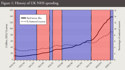
"Public spending on the UK NHS has increased faster than economy-wide inflation since the 1950s, with an average real growth rate of 4.0 per cent a year between 1949/50 and 2010/11"This is a silly statement because it is a wide date range, with some widely different government policies and it makes no sense to give an average. They may as well tell us that the average person has just under two legs, it has just as much meaning. Also, an average increase of 4% a year is a geometric increase (ie non-linear, the gradiet of the graph is not constant) whereas the actual data shows that the increases were broadly linear with three general trends.
I have mentioned before, these three trends:
- 1974 to 1998 there is a year-on-year increase in real terms of around £1bn each year
- 1998 to 2010 there has been a real terms increase of approximately £4.8bn every year
- 2010 to 2015 there is real terms flat funding
For my analysis I only had data (for England) from 1974, the IFS show data (for the UK) from 1949 to present. This data shows that the £1bn/yr real terms increase started at about 1960. I have copied their graph (Figure 1) and coloured it to show the government in power (blue is Conservative, red is Labour):
The Wilson/Callaghan Labour government suffered from the oil crisis and IFS imposed austerity, but it still increased NHS funding overall. The Thatcher/Major period also increased NHS funding. The Cameron period is clearly a new shift, and the IFS is suggesting that a Cameron government after 2015 may provide increases somewhere between flat funding and Thatcher levels of real terms increases.


No comments:
Post a Comment